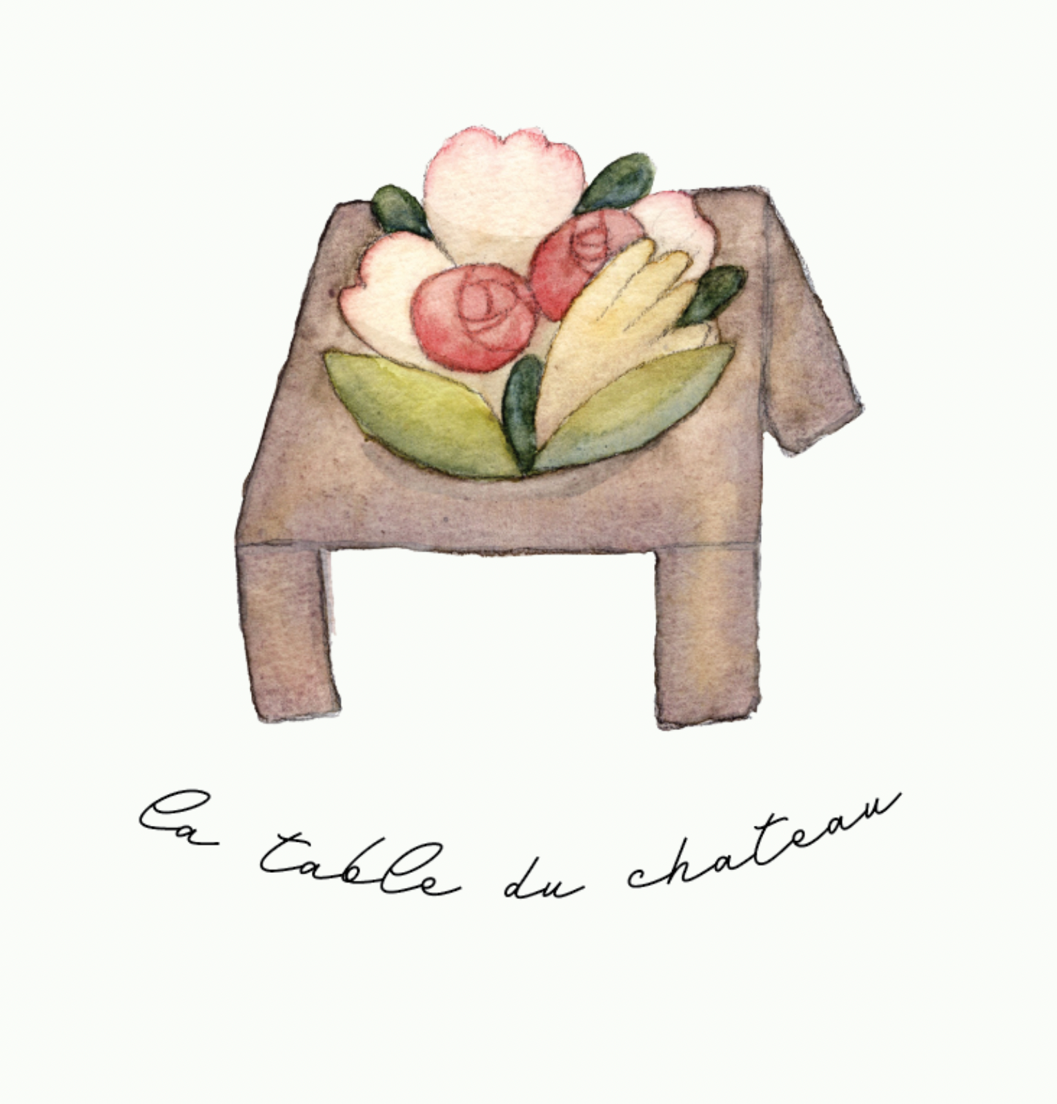
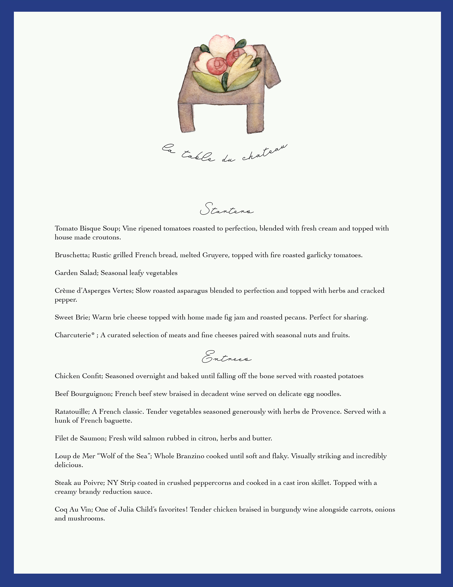
La Table Du Chateau is a French restaurant that requested a rebranding proposal. They asked for something rustic, elegant, and authentically French. Because their name means "the Castle's Table" I wanted to create a logo focused around the visual symbol of a table. I used watercolor as my medium to maintain a rustic feeling, and added a found digital typeface to keep it elegant and clean. I kept my shapes slightly off kilter and abstract for that Parisian playfulness.
For their menu design, I used the logo type for elegant headers and a simple serif typeface for the body text to insure readability. I maximized negative space for a minimal elegant feel, and added a royal blue border that I proposed along with a pale cream for their primary color pallette.
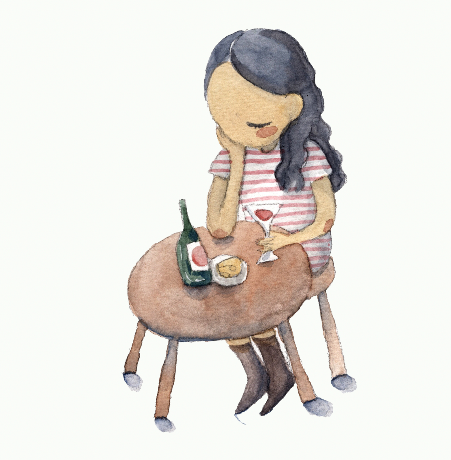
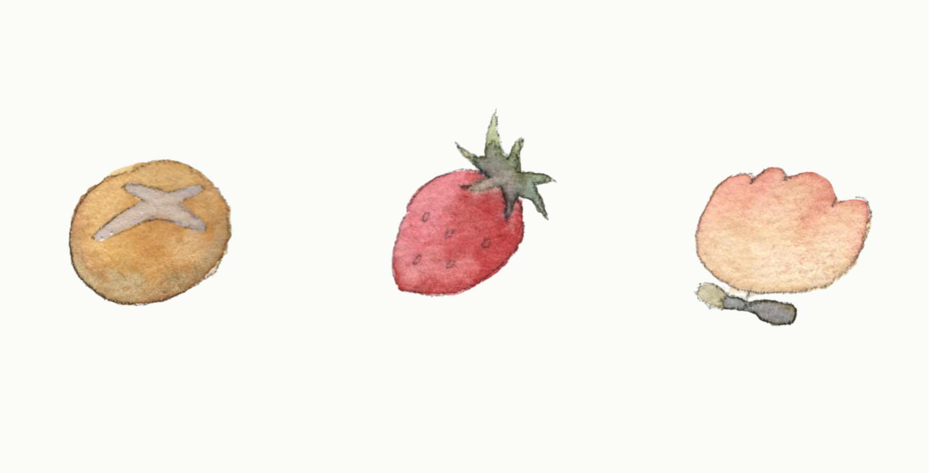
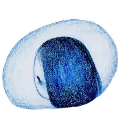
I created a few spot illustrations consistent with the logo design that could be used as assets in fliers, posts, and other promotional material. I wanted to build a narrative around their restaurant, inspired by the beautiful and independent Parisian girl archetype.
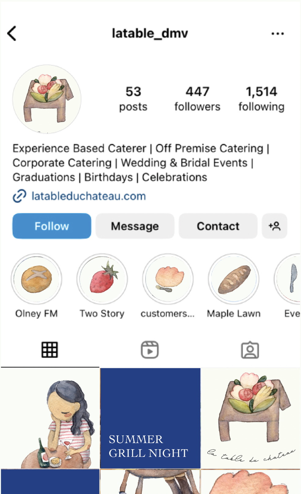
When mocking up how my rebrand assets would apply to their social media page, I first noticed that their page was lacking visual cohesion. I recommended a use of consistent visual assets and typefaces, as well as adhering to my proposed color pallette for large, splash color posts.